Monday 6 May 2013

Receiving my Final Major Project / Presentation


I am extremely pleased with the punctual delivery of my book which arrived within seven days! 


It felt amazing to receive the copies of my Final major project and overall I am so happy with the final product! Here I have added some images of what the book looks like and examples of my page layout's inside and the finished design!  


To present my Final Major Project I want the decoration to look just as professional as the book. Clean, tidy and presentable. I decided on using an off white coloured box to submit my project in and went on to use shredded black paper inside to pad out the box for decoration, and to avoid the box to move around too much. Here are my photographs to display the preparation for hand in. 


Overall I am so proud to have completed this project, it has been extremely tough at times but nevertheless enjoyable to express my passion for make-up and hair design and also dance in one major project. 

I hope all the hard work pays off and my book will be enjoyed by those who are marking. 

Thank you for following my reflective journal blog! 

Natasha Elizabeth Fletcher 
Make-up Artist and Hair Stylist


Last adjustments / Ordering / Shipping

When uploading the book to Blurb there were a few last decisions to make such as:

  • How many copies wanted?
  • What paper type do I want to use? 
  • Do I want to have a dust sheet cover for the book or an image wrap around? 


I decided to order x3 copies of the book to have one for submission, one to give to my photographer as she was consistent and extremely reliable throughout this whole process and one to keep for myself. This came to 160 pounds as the book itself is 44 pages long. 

I asked for advice on paper type and made the decision to order 'premium lustre' finish paper as this type has a slight gloss to it however it is not too shiny that it could effect the image under certain lighting. 

Finally I came to the conclusion of ordering a glossy white 'dust sheet wrap around' with my illustration on the front to present my book. Underneath the wrap around I ordered a plain black linen material as I thought to keep the decoration of the book clean, simple, black and white just like my illustration.  


Admittedly this was a great feeling to have the book sent off to print after all the hard work put into it, although anxiety has kicked in as to how the book will turn out. Delivery states it will take 7-11 days to deliver. 

Fingers crossed!  

Indesign - Layout - PDF

With all final images confirmed and feedback given I went on to the layout of my book. 

The book size will be 12 x 12 and I am going with the publishing company 'Blurb' to print my Final Major Project. This meant I had to use the software 'Indesign' to create the book and as I was a little unfamiliar with this package I learnt a lot as I went along editing the layout and design which proved not as daunting than first thought. Various problems were raised throughout this journey such as how to insert page numbers that are correctly in line on each and every page counting out the opening pages and the fact the 'bleed line' on the Indesign template was crucial to follow to avoid any information from images or text being lost down the crease of the book after printing. 

Other lessons learnt from putting together the book is that the images have to be saved on Photoshop as a CMYK file as many printing companies (including Blurb) only print books in this setting so this had to be checked before sending to print to see if any colour was lost in translation to then be prepared to recover certain colours/tones/shades before finalising the book to print. 

However will help from the I.C.T and photography team I was able to overcome complications efficiently. 


Further help I received was from my main tutor, she gave me pointers on what to exclude or keep in the layout for the book and also double checked over my text and quotes throughout the book.  

After a lot of editing and experimenting on Indesign I have finally come to a close on the layout and here below is the whole book as a PDF document ready to send off to print....


I have carefully thought about the use of colour for each page and have added certain colours to create the mood for some of the dance themes further as well as the colour pallet in the image to set the atmosphere. 

I have tried to keep the layout, text and quotes as clean and neat as possible as I think this gives a professional finish to the book. Presentation is key and I am really looking forward to sending this off to print to see what the actual final product looks like. 

Wish me luck!! 


Front cover ideas...

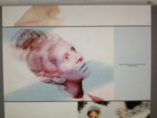
Now all of my photo shoots are finished and finalised as to what images I will be including to the final product. My thoughts are directed at how the book will be presented and what type of paper, front cover and text I will need to involve. 

My theme being dance related as well as make-up and hair design based I wanted to create an interesting front cover perhaps as an illustration and edited on the computer. I started to brain storm ideas as to what I would create that would represent these two aspects of the book. 


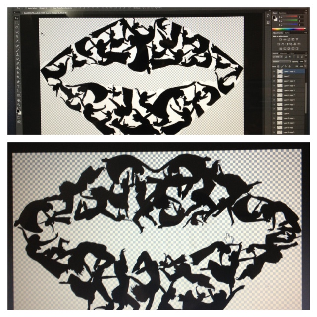
I started to sketch dancing figures in my sketchbook and thought up the idea of creating the effect of arranging my drawings into the shape of a 'kiss mark' to suggest beauty, design and dance.


Here below, is an example of the kind of idea I have envisaged however this is roughly hand drawn. 


I decided to scan my drawings into the computers at uni and save them as a digital picture. This led to me opening the scans into Photoshop and then filling in the figure with black ink to make it bold and clearer than a hand drawn and coloured in pictures. 


I wanted to try out this 'kiss mark' idea on Photoshop so I opened a white template of a lip design onto the software for guidance. 


I created many layers on Photoshop and experimented cropping down the scans and arranging them to face various directions on the lip design to create a hopefully effective illusion.


This was the first attempt at the final design for the front cover as I came across a problem with my computer and sadly after three hours of putting together this design I accidentally deleted the file so regrettably had to start from scratch again.  


However I believe everything must happen for a reason as the second design I put together again on Photoshop looked a great deal better than the first. The image below shows the new design at the bottom. As shown the new design displays a more flowing and artistic style whereas the first attempt looks a little amateur looking at the comparison now.  


This is my final front cover design and I am actually very pleased with the outcome and will use this as my front cover design perhaps without even needing a title because in a way my illustration design tells you what topics the book will touch upon subliminally. 

After another feedback session my tutor agreed with this idea so I am going ahead and making this image my final front cover logo. 


Tap Dance Theme

My final dance theme is Tap Dance, my aim was to create a Hollywood glamour style of shoot to touch upon the classic glamour dance films such as 'Singing in the Rain etc. 

I was a little apprehensive about doing this photo shoot as I hadn't been as planned for this theme as much as some other styles. Never the less I went ahead and constructed a photo shoot a little last minute and carried out a Hollywood glamour type of make-up design  with a modern messy hair style.

I attempted to add a vintage fur coat to set the theme of the idea for tap dance however the images that were  the result of this shoot did not come across as strongly dance related as most of the other final images I will be using for the book. 


The make-up look is clear and clean however after more reflection on this last shoot I have decided to cut this dance style out of the book and have nine stronger shoots to include to print. The images don't express the movement and theme of dance I am aiming for so sadly this shoot is one for the portfolio not for my Final Major Project. 


Jazz Dance Edits


The following images are the re-touched images from the 'Jazz' inspired shoot. As shown and previously mentioned I have darkened the background to a grey/black tone to enhance the gold and bronze tones in the make-up shine and the styling to accompany this colour scheme. 


I want to include four of these movement pose photographs in my book perhaps on a double page spread as I hope it will portray dance and the showbiz inspired glitzy Jazz theme.